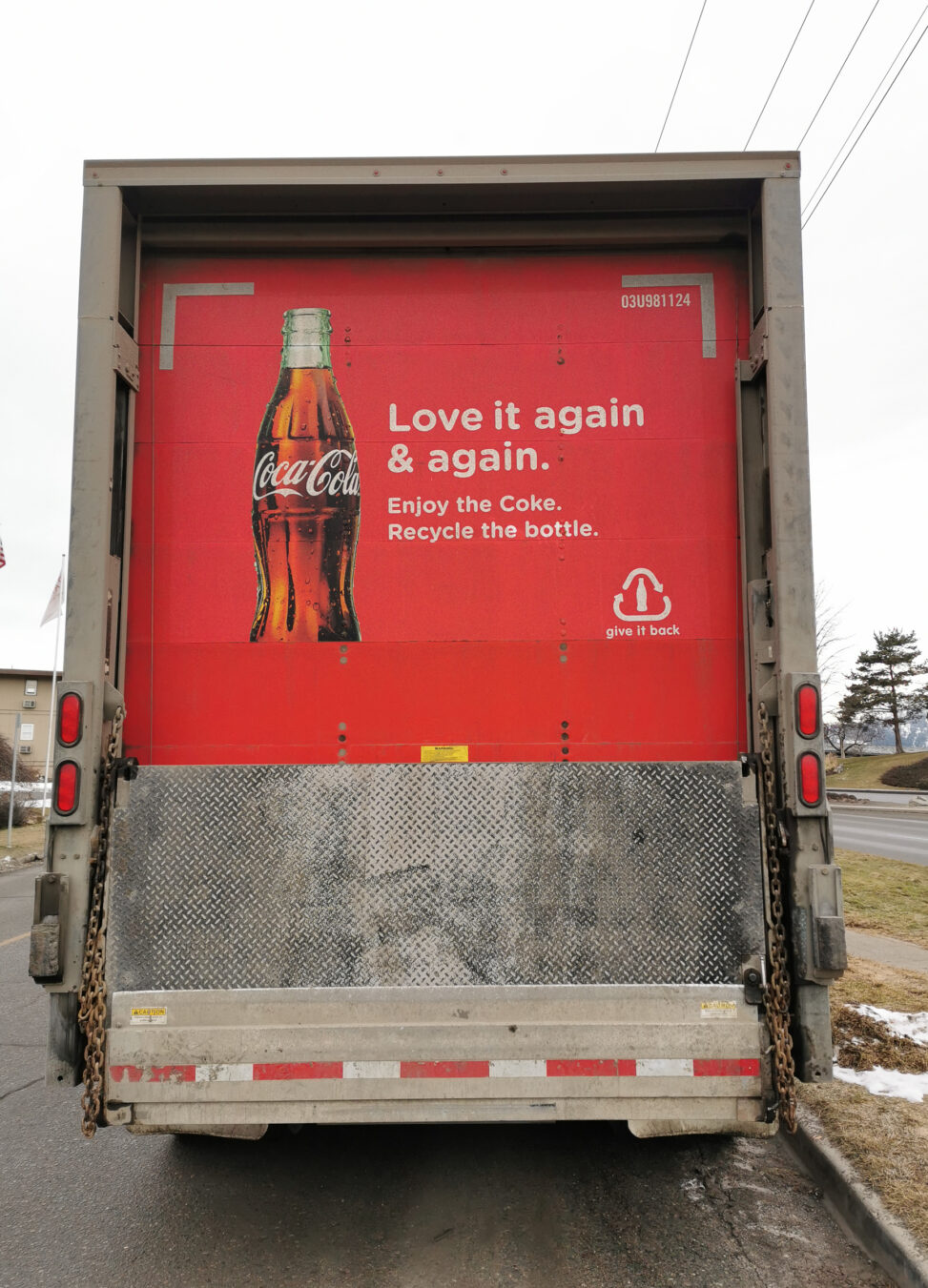
Image Attribution: “Coca Cola Truck Ad – VISA 1500” by Mithran Akattutu is licensed under CC0. (See interactive map)
Mithran Mookandambalathil Akattutu
T00645932
VISA 1500-01
Prof. Terryl Atkins
January 21, 2021
Part A
Coca Cola is known for their creative range of advertisements and attention-grabbing slogans such as “Taste the Feeling”, “Always Coca Cola” (Ryan). This is an advertisement for Coca Cola on their own fleet truck used for transporting Coke, seen in Kamloops. It shows the image of a Coke bottle with a slogan and a message near it.
The advertisement has a bright red background with white strips in the corners that define the edges to give emphasis to the image in the middle. There is an image of a bright, shiny, full coke bottle which gives off a cooling sensation. Right beside the bottle is the slogan that says, “Love it again and again”. Underneath the slogan is a message that reads “Enjoy the Coke, Recycle the bottle”. On the bottom right is a logo for recycling, but with a coke bottle inside it. The image of the coke bottle attracts the most attention as it is a popular brand.
This image not only is an ad for coke, but also shares a message for recycling. It is like a request that the “recycle the bottle” message is included. The white edges in the corner direct your eyes right into the middle, so you do not look away from it. The recycling logo with the coke bottle in the middle is another smart inclusion where it not only reminds you of recycling, but also subtly makes you think of buying a coke.
In my opinion, this advertisement is rather effective to get consumers to notice the product. Considering that a fleet truck travels from city to city, through highways and inside the city itself, people would easily identify it. Most of the time when you are driving behind a truck, you will be forced to look at the back and having an ad makes it more convincing. It would make you think about Coke, and the sensation of drinking a cold soda. When I look at this image, I can feel the sizzling on my tongue when taking a sip of Coke. That makes the ad successful to me. Florentina mentions the Priority Agenda where having a visual of brand names in public spaces influences the consumer’s mind (52). This is also where slogans come into play. When a person is confused about which brand to buy, the easier and more catchy slogans are reminded to them and it manipulates them to decide on that brand. “Always Coca Cola” is a good example for this. I would say the target audience for this would be people aged from 19 to 30 as they have the most consumption of soft drinks in Canada (Statistics Canada).
I found this ad on the truck parked near a hotel in Kamloops, where it was unloading Coke. I was walking to my house and I could see the bright red color from far away and already recognized that it was a Coca Cola truck.
While Coca Cola’s mass production causes huge issues such as water loss, waste management, air pollution etc., the company claims that their goal is to make 100% recyclable packaging by 2025 (The Coca Cola Company). They say 60% of their bottles are already either refilled or recycled. I would say they are trying to do their part as an organization to reduce their carbon footprint and battling the issues they cause from production practices.
Overall, this advertisement is effective in reaching out to consumers across various places as it is a travelling ad. The bright red color and the image of the bottle and the slogan are the highlights of grabbing people’s attention.
Works Cited
“Findings.” Health Reports: Beverage Consumption of Canadian Adults: Findings. Government of Canada Web. 21 Jan. 2021.
Florentina Manuela Dumitrescu. “The Dimension of The Socio-Cultural Brand of Coca-Cola”. 2016
Ryan, Ted. “Cola Slogans through the Years.” Coca. 27 Feb. 2019. Web. 21 Jan. 2021.
“Sustainable Packaging: The Coca-Cola Company.” Sustainable Packaging | The Coca-Cola Company. Web. 21 Jan. 2021.

