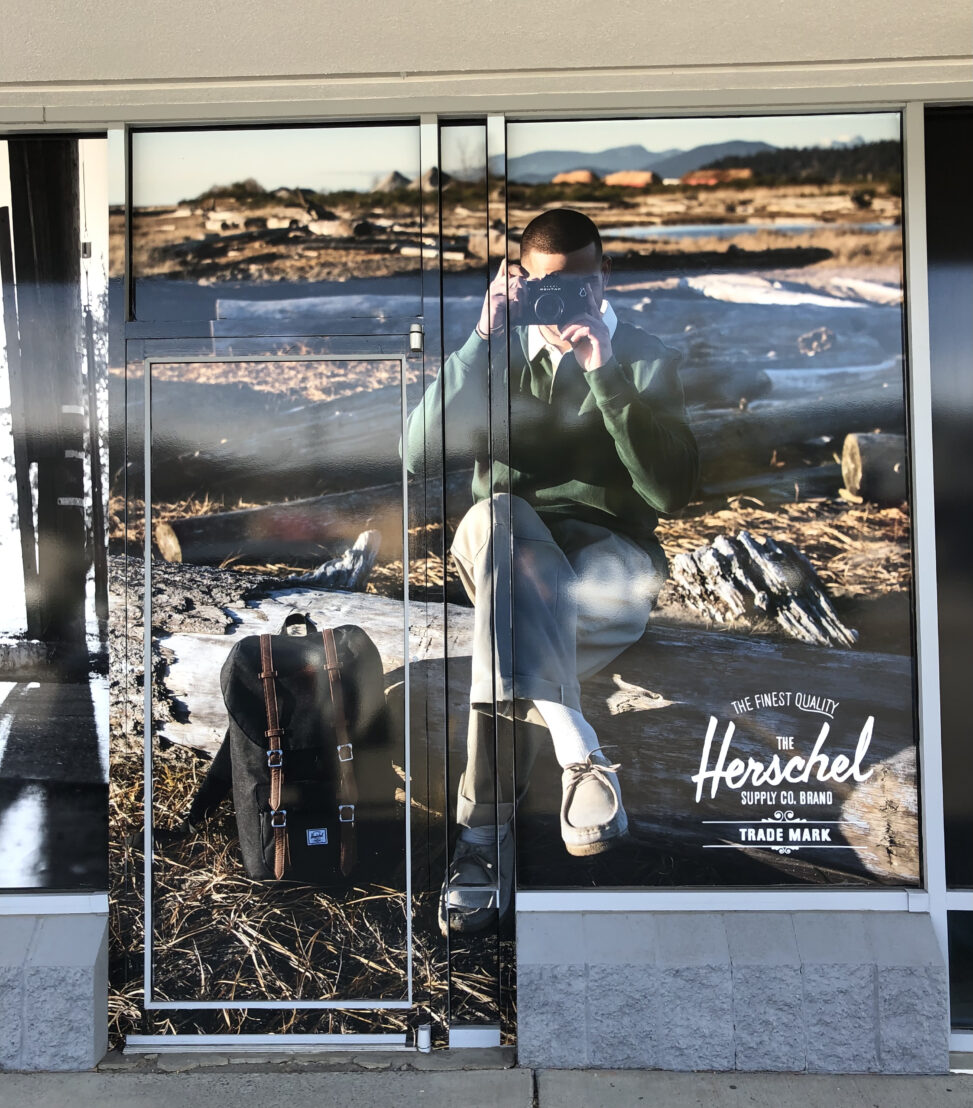
Image Attribution: “Herschel Supply Co. Advertisement” by Parth Zalawadiya is licensed under CC BY-SA. Notre Dame Dr, Kamloops, BC V2C 6T6, Canada (See interactive map)
Parth Zalawadiya
VISA 1500_01
Dr. Terryl Atkins
Assignment 1, Part A
The above advertisement focuses on the finest quality Backpacks by the Herschel Supply Co. brand. It was created to show the finest Herschel backpack, and how it can blend in everywhere. You can take this backyard, on hiking, at school, when you’re going for a campfire with friends and so on…
The advertisement is very appealing. The picture was taken under the sun in a very remote location out in nature. The top of the photo is blurred, the focus being on the center and the bottom. In the middle of the picture, a male model is sitting with the legs crossed, camera in the hands, trying to take a photo with focus facing the viewers. The posture of the person looks very confident. The color of clothing is not very bright, which sits with the environment. He seems warm and comfortable. The placement of the Backpack on the bottom left corner of the picture, next to the person’s feet is very deliberate. The color of the backpack is black with some brown which sits with the environment. The visual elements like the backpack, the camera, the shadow of the person, and the backpack trigger the photograph. The bottom right corner of the advertisement has the brand name in bold “Herschel”. The text above the logo reads in caps “THE FINEST QUALITY”.
The photo is trying to communicate to the audience who like to go for hikes and would like to get fashionable but classic design backpacks. It shows that the backpack is not only fashionable but also functional. These types of backpacks are for “everyday travelers” and on Herschel websites, they mentioned that it is “inspired by the world around us with thoughtful details to enhance customer utility” The color of the backpack in this picture, matches the background, the woods, and the soil as well. They are using a neutral color, but which is eye-catching at the same time.
I came across the advertisement, the Herschel Supply Co. as I was walking past the summit shopping center outside the ONE Boardshop. The placement of the advertisement was very noticeable as it was on the outside window, right. by the door, big enough for everyone to notice before walking in. Since the male model was facing the viewers, in my opinion, the picture is extremely effective and convincing to the audience.
According to the setting mind website, the company just launched an eco-friendly collection. “each Herschel bag was made with between 11 and 22 post-consumer water bottles. The water bottles in question were collected, cleaned, melted, and spun, before being woven into fabric and then sewn into bags.” says Emily Southey (2021) This is incredibly impressive for a company as big as Herschel.
Reference:
Southey, E. (2021, February 16). Herschel debuts bag collection made from recycled materials. Setting Mind. Retrieved September 24, 2021, from https://settingmind.com/herschel-debuts-bag-collection-made-from-recycled-materials/.

