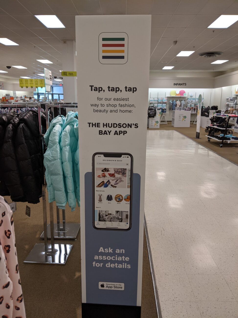
Image Attribution: “Hudson’s Bay Company – VISA 1500, 2021” by Hudson's Bay Company is licensed under CC0. {50.65618346443197,-120.37069615186766} (See interactive map)
J. William Howard
T00638902
09/24/21
VISA 1500 – Fall 2021
Assignment 1 – Part A
The advertisement above is in the Hudson’s Bay department store in Kamloops B.C. It is an informational advertisement directed at customers to attract interest in the company’s phone app. The advertisement starts with the new app icon featured at the top/center followed by a catchy phrase directly below informing the customer of the Hudson’s Bay online store. The goal of the advert is to inform customers of the Hudson’s Bay app for their mobile device that they can use to make their shopping experience easier.
The design from top to bottom has a very welcoming tone. It’s bright and simple which conveys care so as not to intimidate someone with an overload of information. The image at the center of the mobile phone displaying the app is clear both in view and message. The wording is catchy, easy to read, and brief. Ensuring you don’t get distracted part way through and leave with only half the information.
The message to the consumer is that by using the Hudson’s Bay app they can make shopping easier. Conveyed through the image of the (possible) app home screen which features several products from various departments. This image expresses the idea that you can find anything you need, all in one place on the app, which for most people triggers an innate sense of ease.
In my opinion, the advertisement fails to make a concrete connection with the consumer. While the information is succinct and clear it feels disconnected. I am after all shopping in a brick-and-mortar department store that is actively directing me to an online format. It also encourages an easier experience online which in a way sets the opposite tone for my instore expectations.
The advertisement is posted in multiple locations within the Hudson’s Bay store on both floors. It stood out to me for two reasons. First of which was that it was a repeating sign that didn’t contain something sale-related. Secondly was the wording just below the image of the icon at the top center of the advert “Tap, tap, tap”. After reading it stuck in my head, there was a certain charm in the way it sang itself in my mind much like an old television ad jingle. “Tap, tap, tap, THE HUDSON’s BAY APP!”
The Hudson’s Bay Company is a very old and recognized brand in Canada as far back as to be featured in some of my early grade school history classes. Hudson’s Bay Company has had a complex journey as a retailer since it began as a leader in the fur trade which had a profound effect on Indigenous peoples. The fur trade made Indigenous peoples reliant on European goods and saw the need for expansion into new territories in pursuit of fur-bearing wildlife. Frequent contact with European traders led to the exposure to diseases like smallpox that ravaged populations.
More recently in 2011 Hudson’s Bay made Canada’s Environmental Offenders Registry after dumping 146 kilograms of toxic industrial chemicals into the St. Lawrence River and were subject to pay $765,000 in damages.
The Hudson’s Bay Company has had a rocky history and has made a few headlines throughout the pandemic; however, most information is rather an opinion based on those topics. It will be an interesting company to watch as it continues to navigate the adapting retail world.
References:
Ray, Arthur J.. “Hudson’s Bay Company”. The Canadian Encyclopedia, 08 October 2020, Historica Canada. https://www.thecanadianencyclopedia.ca/en/article/hudsons-bay-company. Accessed 24 September 2021.
McSheffrey, Elizabeth. “The Hudson’s Bay Company Punished after Releasing Toxins into St. Lawrence River.” Canada’s National Observer, 15 Dec. 2016, www.nationalobserver.com/2016/12/14/news/bay-canadas-iconic-department-store-gets-punished-releasing-pcbs-major-river.

