Image Attribution: “The Columbia Diner Advertisement Analysis” by Alina Shevchenko is licensed under CC BY-NC-SA. (See interactive map)
Alina Shevchenko
09/23/21
VISA 1500 Fall 2021
Terryl Atkins
Assignment #1 Part A
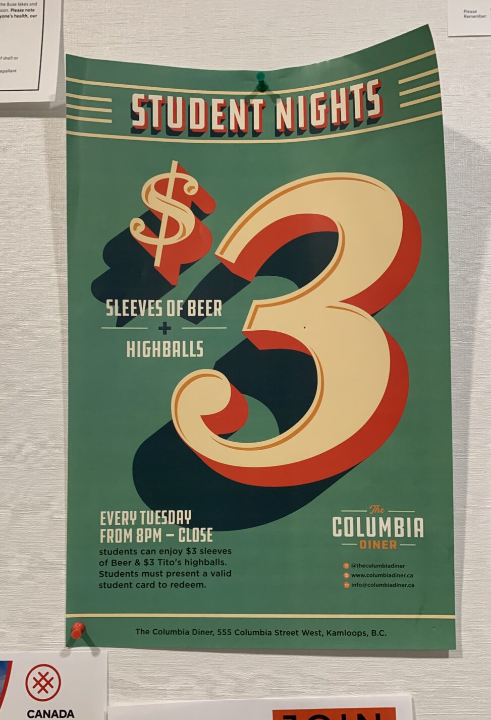
This advertisement is displayed on the bulletin board at TRU University in the Old Main building and it was created by the Columbia diner restaurant. The advertisement shows a graphic illustration of the dollar and the number 3. In addition, there are many inscriptions with clarifying information. This advertisement carries an offer about a special offer for students for drinks on Tuesday evenings.
The number 3 is shown in the center, which conveys the most important information about the price. The inscription students nights is on top and this inscription is edged with stripes. At the bottom right is the symbol of the restaurant, the social networks of this restaurant and at the bottom left is a description of the terms of the promotion. Considering the colour scheme, it can be noted that the combination of neighbouring colours of green and yellow and the use of a complimentary red colour. This combination creates a harmonious and contrasting triad.
The image conveys the desired effect, namely, a large figure attracts attention. 3 dollars is not such a big price because of this, people passing by this ad pay attention and are interested in what you can buy for such a price. The design idea with the scale, colour and location of objects in the image create a significant effect on human perception. The eyes react quickly to brightness, elements and volume. Therefore, this ad can be considered effective for communicating information to the target group, even though there are no photos on it.
As I mentioned at the beginning, I saw this ad in Old Main. The image is eco-friendly because it is located in the right environment. It is impossible not to notice the offers for students in one of the most prominent places. Almost everyone who saw this ad fits the description of students since this is a university room. However, it is worth noting that this advertisement offers promotions for alcoholic beverages, and underage children also study at the university. That is, there are still categories of people who do not fit this ad. But since the main part is suitable, we can conclude that the ad is located in the right place.
Even though before I saw this ad at the university, I did not even know about the existence of this restaurant, their action attracted attention and interested me to see the location of this restaurant and study the menu a little. Thus, thanks to a well-made advertisement, you can achieve the desired effect and promote your institution.

