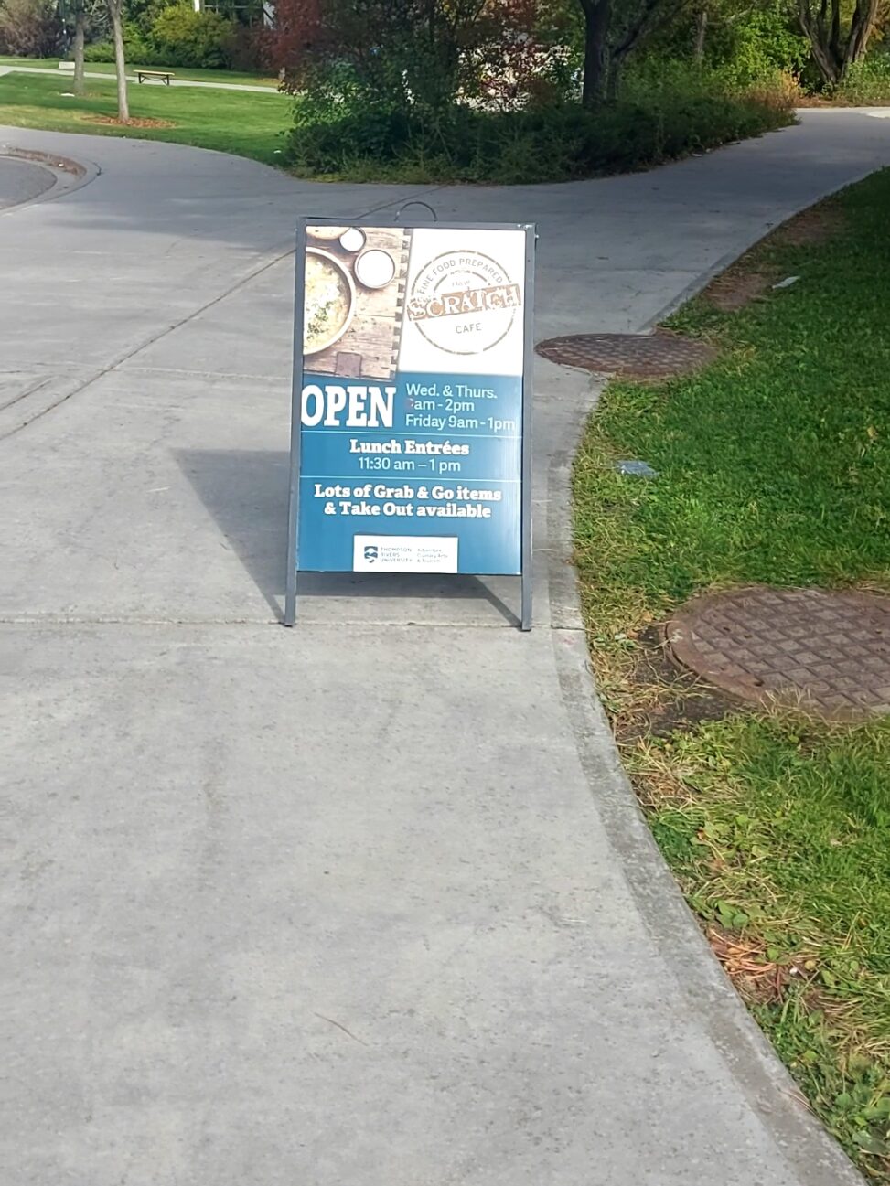
Image Attribution: ““The Scratch Cafe sign by the rainbow crosswalk at TRU”” by Lauren Bacon is licensed under CC BY-SA. (See interactive map)
Lauren Bacon
September 24, 2021
VISA 1500 Fall 2021
Terryl Atkins
Assignment 1 Part A
The advertisement is located on the Thompson Rivers University Kamloops B.C. campus. At the very bottom of the sign there is a Thompson Rivers University logo highlighting the Adventure, Culinary Arts and Tourism department. This type of advertisement highlights the consumption of goods. The advertisement roughly shows the logo of The Scratch Café, the word OPEN, then lunch entrees and options of grab and go items as well as takeout. This advertisement was created to highlight and portray the abilities and services that the culinary arts students at Thompson Rivers University are providing for their training and future careers.
The photo that I took of the advertisement was taken at about 2:30pm on September 23, 2021, on the sidewalk to the left in front of Old Main when facing the university.
From the left center of the sign my eyes are immediately drawn to the bright thickly bolded OPEN. From those words my eyes draw to the upper left corner of the signboard, that has a kind of soup or stew on an aesthetically pleasing cutting board with a fresh sprig of thyme or rosemary. There are creams or yogurts that can be added to the dish and a slice of bread on the side.
My eyes are then drawn to the upper right corner of the signboard which has the logo of The Scratch Café. In fine print within the outer edges of the circle boasts that this small establishment prepares fine food. Then reading below the logo, my eyes are lead to the times it is open which are Wednesday and Thursday from 8am – 2pm and Friday from 9am – 1pm. After that my eyes are drawn to when lunch entrees are available, then they are drawn below to the words mentioning that there are foodstuffs that can be taken and carried.
The image does carry out the intended effect in the way that it will appeal to students and staff who desire to have delicious food. The pictorial elements used to get the message across is the food being served on the cutting board and the logo. The elements interact by giving off a warm and rustic air which is applied from the food and cutting board and the slightly scratched look of the logo. The image had the desired result and I tried some of the food. This advertisement is somewhat noticeable it is in an ideal location because of the high traffic but the image has a lot of brown, blue and white making it somewhat bland making it boring.
I only recognize this brand because I heard of it during the campus tour, and it was a place that seemed worth looking into. The Scratch Café is mentioned to have baked goodies, sandwiches, soups and salads, vegetarian options and hot entrees. On the TRU retail services website it mentions that the food is “made from scratch, sourced locally, sustainably and ethically wherever possible” the site also provides that on Facebook the menu is posted daily as well as updates. It is also highly reviewed with a rating of 4.7 stars on google reviews.
References:
Thompson Rivers University, www.tru.ca. “Scratch Café.” Thompson Rivers University, Thompson Rivers University, https://www.tru.ca/culinary-arts/retail-and-services/scratch-cafe.html.

