Image Attribution: “Advil Ad Analysis- VISA 1500” by Madison Hubbard is licensed under CC0. (See interactive map)
Madison Hubbard
VISA1500_01
2020-09-23
Assignment 1, part A
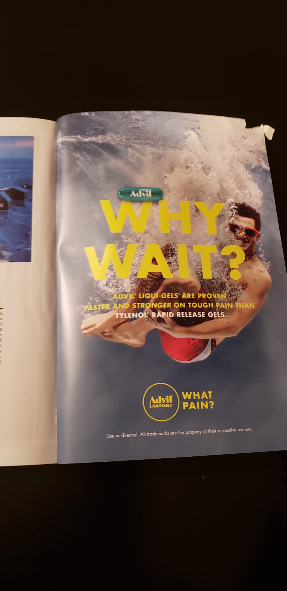
In every magazine, there are plenty of advertisements what seems like every couple pages. The National Geographic magazines are no exception. While browsing through one of said magazines, I found this Advil advert. In this ad, Advil is trying to sell you Advil Liqui-Gels. The background is a grey-blue colour. In the centre of the page is a young man in red shorts and sunglasses in cannonball position smiling at the camera. There are lots of bubbles all around the man, going from him up to the top right-hand corner. The bubbles are also seen coming out of his nose and smiling mouth. In front of him are the words, “WHY WAIT?” in bold yellow text. Directly below this are the words, “Advil liqui-gels are proven faster and stronger on tough pain than” in much smaller yellow text, and again below this, in the same size font but this time in white, are the words, “Tylenol rapid release gels.” At the bottom centre of the page is the Advil logo and the words, “WHAT PAIN?” in bold yellow writing beside it. Below this is the words’ “Use as directed. All trademarks are the property of their respective owners.” in tiny white text. The photo is realistic and clear. I can see every element nicely.
The words “why wait?” indicate that the product works quickly, and the words “what pain?” indicate that the product also works effectively. The picture of the smiling man and the colours used in the ad gives off a feeling of summer and fun. I interpreted this as the company saying that their product works quickly and effectively enough that it allows the consumer to go out and be active without having to worry about pain. The ad also claims that Advil works better than Tylenol, mentioning the other brand by name. I found this to be a relatively bold move. Most of the time I see competing brands merely alluding to their competitors, but this ad mentions its competition by name, and also claims its product to be “faster and stronger” than the other’s.
I found the ad to be eye-catching in that it had a nice balance of both bright and muted colours. The picture was also right next to a small article about a photo contest with a picture of the winning photo. The article has a white background and the image is dark and far more dull and unexciting than its neighbour.
I recognize this brand as it is commonly found within my own home. My family always has some Advil in the medicine cabinet.
I could not find any websites or articles criticizing Advil, but instead found many sites judging Tylenol.