Image Attribution: “Canada Dry Advertisement” by Canada Dry is licensed under CC BY. Real Canadian Superstore, Columbia Street West, Kamloops, BC, Canada (See interactive map)
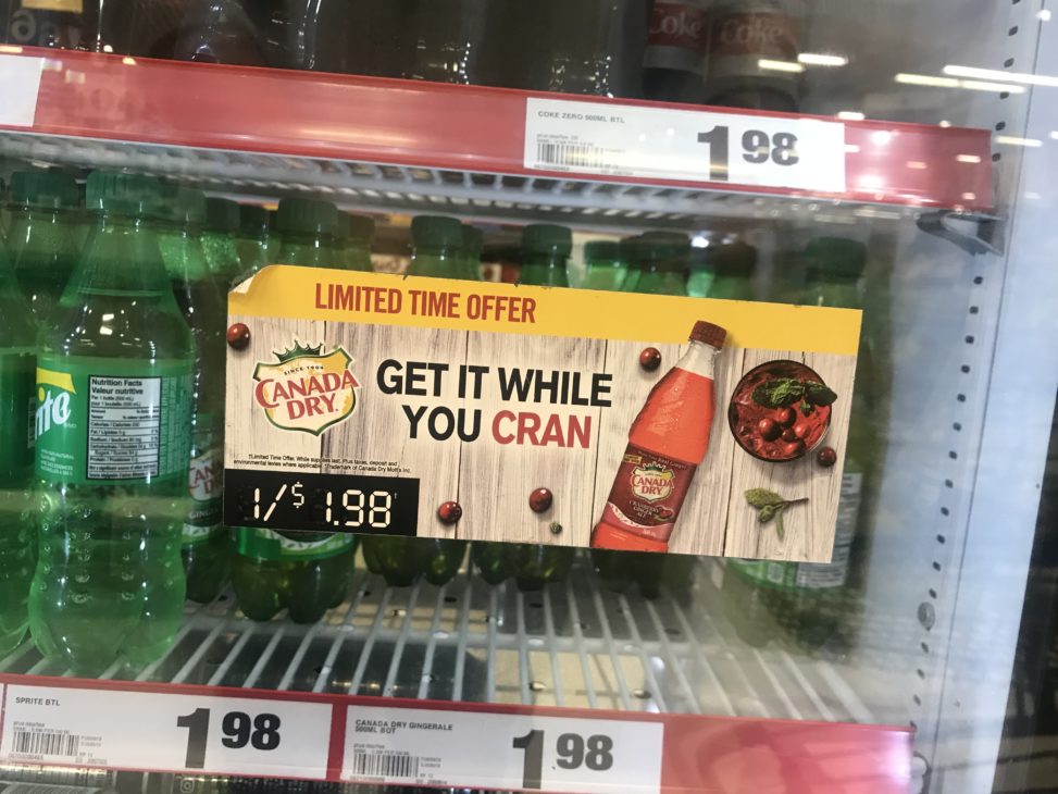
The advertisement I have found was made by Canada Dry, selling their new limited time cranberry flavour ginger ale. In the ad they show the bottle of cranberry Canada Dry next to a bowl full of fresh picked cranberries. They have created this advertisement to sell their limited time cranberry drink.
On the top of the advertisement they place the words “limited time offer” in bold red letter with a yellow background. Underneath the “limited time offer” they made the background a light wood flooring to make the red drink “pop” and be noticeable. On the left centre they put their logo. In the centre they wrote “get it while you CRAN.” Every word except for CRAN is in black and the word CRAN is red. On the right is the bottled drink and a bowl of cranberries. On the bottom left of the advertisement they put “1/$1.98” in white with a black background and it makes it seem as if it is an amazing deal. This ad was placed on a mini fridge full of bottled/canned drinks in the check out aisle at superstore. The ad was clear and bright, it attracts the attention of someone just walking by it easily. The ad is very realistic with the pictures as it was an actual photograph rather than a drawing.
The images intended effect is to make people want to try a new drink. Canada Dry is made out to seem like a drink that you have when you are sick because it is generally just plain ginger ale but now, they have flavoured it with cranberries, and it catches people attention. If someone walking by this ad is interested in it, they will think twice about trying something new but since it is bright red it makes consumers want it more.
This ads target group is mainly anyone going to pick up groceries. Usually by the end of a grocery shop people like to get themselves a treat and if they see something new at a good price, they are more likely to want to purchase the item. The image does not have a great effect on me as I personally do not like ginger ale or cranberries and the thought of them mixed together does not sound appealing to me at all.
The ad was placed on a mini fridge in the checkout aisle at superstore. The ad is noticeable if you look down and slightly to the right, the ad is a bright red, so it catches people eyes easier than if it was plain and not as bright. Where the ad is placed makes me believe that the company wants to sell their product and even makes me think twice about purchasing the drink.
This company’s brand is very recognizable. I have seen it everywhere since I can remember. When I think of Canada Dry, I think of a drink you have while you are sick with an upset stomach.
On all of Canada Dry’s products they have the phrase “made with real ginger”, when they put the phrase on it brought up a lot of lawsuits down in the U.S. since the health authorities did a study and the amount of actual ginger in the product was 2 parts per million. Since then they have taken that phrase off, but they kept it in Canada since once they did that their sales went up by 9%. -National Post

