Image Attribution: “Emily Warner Assignment 1, part a /Fall 2021 VISA 1500” by Emily Warner is licensed under CC0. (See interactive map)
Emily Warner
Fall 2021
VISA 1500
Thompson Rivers University
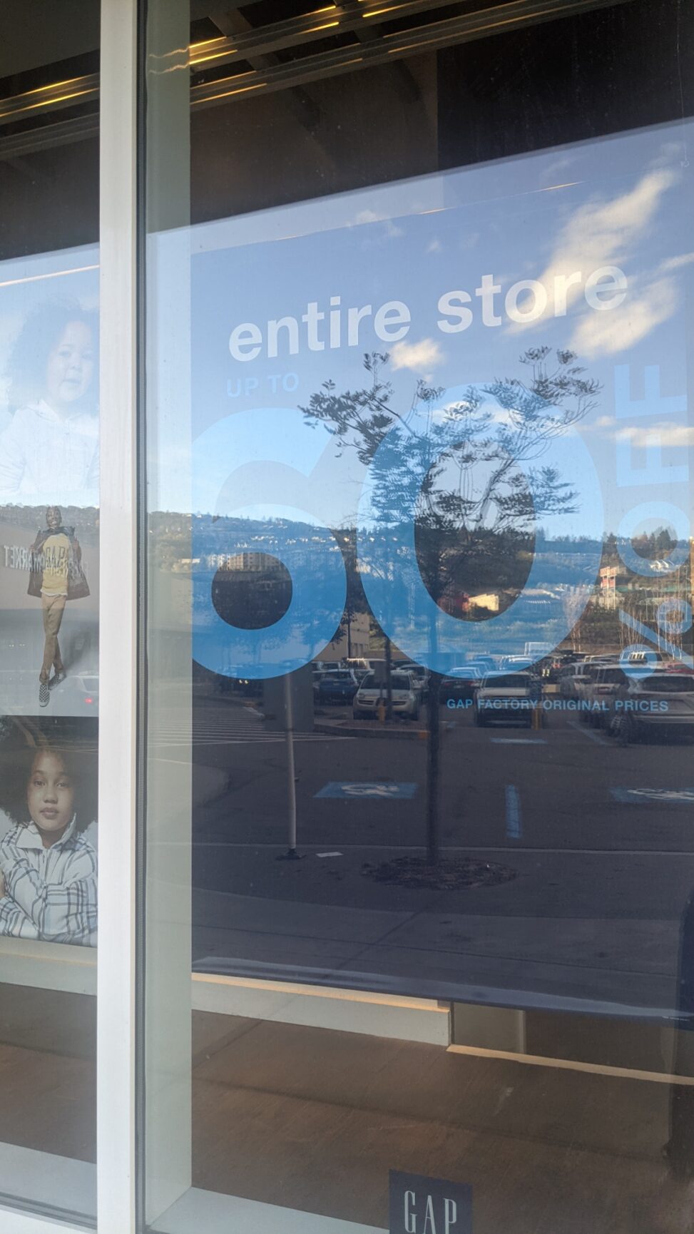
As I was shopping at the Aberdeen mall in Kamloops, I noticed an advertisement in front of The Gap store. The design of the poster is very simple and plain-looking. It uses a lighter shade of blue as well as a darker shade of blue. It is explained on the poster that everything in the store is up to 60% off. This sign is meant to attract customers to shop in the store for clothes. I don’t believe that there is a target group of people that they are trying to “attract I believe it’s everybody that walks by the store to come into the store to shop for clothes. The gap has clothes for people of all ages and sizes.
The gap has just released its fall collection and is having a big sale to attract new and regular customers who have been shopping there for a long time. I believe that the sign could have been improved by showing a picture of the clothes or the products that they sell or having more of a pop of color other than the blue that’s in the sign. This would help grab the attention of the customers more and will more likely influence them to shop at The Gap. The Gap cares deeply about sustainability as mentioned on their website. The Gap also cares about the workers who make the clothes. The Gap makes sure that the workers are working in a safe and positive environment.
Their website states that “As one of the leading apparel retailers, we rely on a world where people and the environment thrive. Like other global businesses, we recognize that we contribute to and have the opportunity to address systemic social and environmental challenges. We are committed to augmenting business value, minimizing our environmental impact, and working with all sectors to achieve progress on global goals.” As I read this, I felt good about shopping at The Gap.