Assignment #1: ADVERTISING
Liam Marshall
September 22, 2020
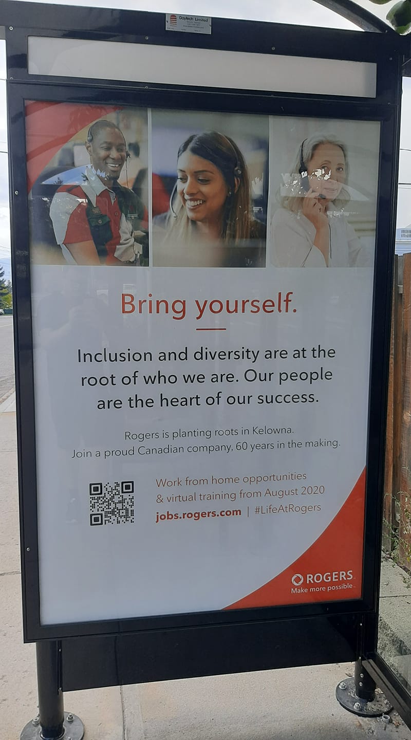
I have come across an advertisement that belongs to the company Rogers. Rogers Wireless is a Canadian based telephone company. This ad is used to draw people towards consideration for applying for a job with this company. It was created with the intention to create more jobs for Rogers Wireless. A rough description includes staff at work from various locations, with plenty of text for the consumer. The advertisement first says, in larger letters, “Bring yourself. Inclusion and diversity are at the root of who we are. Our people are the heart of our success.” Below this, it reads, “Rogers is planting roots in Kelowna. Join a proud Canadian company 60 years in the making. Work from home opportunities & virtual training from August 2020.” Below this is a link to the website and the hashtag #LifeAtRogers, and to the left of this link is a QR code that takes anyone with a smartphone directly to the site to apply. In the bottom right of this poster, The Rogers logo with their slogan “Make more possible” is shown. There is quite a bit of negative space to the left of this, with the bottom center and bottom left having nothing there. The entire top third is taken up by photos of three people – a young man, a young woman and an older woman, all different ethnicities. The text of this poster takes up roughly a third of the poster as well. All these workers are not blurred in any form and look pleased in some fashion. The body language suggests that the first two employees are having a good chat with whoever they are supporting, and the last employee appears to have finished a call.
The message of this ad shows that this company claims to have a diverse and inclusive working environment. This is shown through the photos in the ad to consist of people of colour. As these are the only pictorial elements shown in the ad, it winds up looking more as “Hey, take our word for it with these images!” It interacts with the consumer where if they read the ad from top to bottom, they see the people of colour first, then the bright, red wording referencing said photos.
This feels like a somewhat miniscule attempt to reach the target audience. While Penticton and the Okanagan does have a diverse population, it feels like there’s not enough people in my city who would see this ad and think it’s directed at them as a visible minority. To me, it does not really feel like much, I wouldn’t give it much attention if I was at the bus stop, which is where I found it. The ad isn’t super noticeable in my neighbourhood, especially since that bus stop is more used for kids on their way to school who can’t really work from home. While this brand is recognizable to most Canadians, it’s been criticized for their anticompetitive advertising tactics, most notably violating false advertising rules, according to The Globe and Mail. As a result, they changed their ads for this issue, and have now focused more on getting people to work for them. Phone companies like Rogers don’t change much, if at all.

