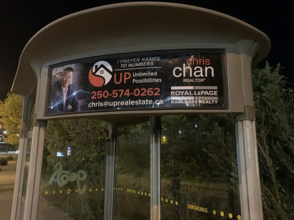
Image Attribution: “Royal LePage Realty Ad, Sept, 2021” by Quinn is licensed under CC BY-SA. (See interactive map)
The picture shown above is an advertisement from the real estate company Royal LePage, it is a still image on the side of a bus shelter and was created in order to make viewers want to contact their realtor Chris Chan. And this advertisement has succeeded in its job and convinced me that Chris is the realtor I want to hire… If I could afford to buy a house that is. In order to show why this advertisement works so well, I will be describing each element of the image, explaining how these elements swayed me, and how the location of the advertisement impacted its effectiveness. Before any in-depth analysis can begin I will need to begin by describing the elements of this advertisement.
Beginning the description on the leftmost side, there is a staged photograph of Chris leaning forward and looking at the camera while smiling. He is wearing a blue suit which is similar to the background and helps to incorporate him into the photo. The point of view of this shot is looking up at Chris which signals that he is important. This photograph has soft lighting with a gradually darkening shadow that transitions into a black background, this does an excellent job of blending the photograph into the advertisement. But, leaves very little space in front of Chris making the photograph seem cramped. In the middle of the advertisement, there is a logo showing the top of a house with a red symbol, This helps to further associate Chris with buying and selling homes. Next to that is a quote from Chris that states “I prefer names to numbers” as well as his tagline “Unlimited Possibilities”, this is much smaller than any other text in the advertisement. This helps to make the advertisement appear less busy and crowded as well as ensuring that the eye is drawn to the more important information below it. The aforementioned logo and text are coloured white and red which contrasts well with the black background and catches the eye. Under that, is a phone number and email address for Chris. Lastly, on the rightmost side of the sign, it displays Chris’s name, his profession, and the company he works for.
Starting with the left side of the advertisement. The picture of Chris worked well to serve the purpose of the advertisement. Since Chris is wearing a suit this shows that he is professional and lends him credibility and status. To the right of that, the logo and accompanying text quickly gives viewers a sense of what Chris does without needing to directly state it. On the rightmost side of the image, these elements give Chris credibility by stating his career and associating him with a well-known company. This company also runs the shelter foundation which by association improves his moral character. This advertisement also does a good job of standing out by selecting a black background and colouring all the elements in the foreground contrasting colours like black and red. All of the individual elements work together to reinforce the image of Chris as a competent and friendly realtor.
This advertisement does work with the location it was placed in, but not perfectly. Since it is on a bus shelter it will be advertising to people who will be waiting by it for minutes or walking by it in seconds. This advertisement places the most important information, that being Chris’ phone number and email near one of the crash points of the image making it a focal point and showcasing the most important information to those who only have seconds to see the advertisement. However, according to a study done by Rick T. Wilson and Brian D. Till “Subjects who are exposed to outdoor advertising that is embedded within positively valenced (negatively valenced) environments will have higher (lower) levels of purchase intent toward the advertised brand”. Or in other words, having a good advertisement in an appealing environment, such as next to a busy road in the case of this particular advertisement, will have less of an effect on making people purchase a product or service.
Sources cited:
Shelter Foundation. Retrieved September 28, 2021, from https://www.royallepage.ca/en/realestate/about-us/shelter-foundation/
Wilson, R. T., & Till, B. D. (2011, August 3). Effects of outdoor advertising: Does location matter? Wiley Online Library. Retrieved September 28, 2021, from https://onlinelibrary.wiley.com/doi/full/10.1002/mar.20418

