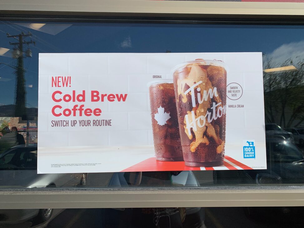
Image Attribution: “Tim Hortons’ New Cold Brew Coffee Advertisement” by Avery Stainton is licensed under CC BY-NC. (See interactive map)
Avery Stainton
VISA 1500
September 27th, 2021
Dr. Terryl Atkins
Tim Hortons’ New Cold Brew Coffee Advertisement
Nearly every morning, I find myself taking my vehicle through the Tim Hortons drive through to purchase myself a cold, caffeinated drink to start my day. On this day, however, the drive through was closed for construction, and I was forced to head indoors to order. That was when I noticed the glorious advertisement for the “New! Cold Brew Coffee” on the front window. The poster depicted two glistening glass cups containing similar brews, one “original” and one “vanilla cream”. I was intrigued, and had to try it for myself, which was exactly what the poster wanted me to do.
The advertisement’s design itself is rather simple; the two drinks sit slightly off center and heavily in focus, with bold red stripes drawing the eye to the base of the glasses. The most interesting drink is placed in front of the other, leading the way with it’s swirls of vanilla and coffee. At first glance, it also appears that the background is plain white, but as you draw closer, it becomes apparent that the drinks are sitting on top of some sort of countertop. They seem to be freshly made according to the slight condensation on the glass. By placing food or drink on a counter, it subconsciously draws the viewer to want to consume it, since the kitchen is where things are to be eaten. Despite this, the two drinks are still very much the main focus, as they have high contrast in comparison to the stark white setting they rest in. An advertisement also typically features some text to describe what it is that they are selling. In this case, the text is mainly located to the left of the drinks, in the same red as the stripes. This main text describes the main concept of the drinks, while subtle texts, such as the “smooth velvety taste” add somewhat of a whisper, to continue to entice the viewer.
The main message of this advertisement is to “switch up your routine” and take a chance with this new drink. Note how the advertisement does not state the price, as this could likely deter valuable customers from waning from their cheap iced coffees. Again, the subtler texts call the viewer with its dare to change to this new drink, alongside the delicious colour combo of red, cream, and brown. All of this imagery interacts to create an effect that is hard to resist, whether or not you drink coffee.
Again, the main goal of this advertisement is to get the customer to try out a new product that the company is advertising. The target group is the large amount of the Canadian population that drives through Tim Hortons on a daily basis. I personally know that their advertisement has been working, as I myself am part of that population, and I bought the drink as soon as I heard about it.
This specific advertisement was found on the outside of one of the Tim Hortons locations in Valleyview. The poster caught my eye because of it’s harsh contrast against the dark tinted windows that it was attached to. Where it sits, it can also be seen from the drive through. However, if this one passes by unseen, the same advertisement can be spotted on their digital menus outside; the perfect place to put them if they want someone to order!
Overall, Tim Hortons is known for its coffee and food, so its not a surprise that they have nailed their advertising tactics down as well. With the money and influence they have, the company has made an effort to lower their impact on the world; I’m sure we have all spotted more than a few stray Tim Hortons packages on the sides of the highway, blowing about. Now, most of their packaging is compostable or recyclable, which is a huge leap from a few years ago. In 2019, Sarah King from Greenpeace, explains how Tim Hortons had not provided a clear answer or drive to fix the large environmental issue they have created. She critiques that the company has not been stepping up to own their mistakes and make proper changes. Since 2019, however, Tim Hortons has made some great steps forward according to Connie Vitello from Environment Journal. She explains how they have made strides and changes such as 100% recycled fibre napkins, replacement of plastic straws with paper straws, and new paper based wrappers. Hopefully Tim Hortons continues to make things better for our planet, while also providing the country with their delicious drinks.
Works Cited
King, S. K. (2019, February 8). Time for Tim Hortons’ Roll Up the Rim campaign to stop fueling plastic pollution. Greenpeace. https://www.greenpeace.org/canada/en/story/7396/time-for-tim-hortons-roll-up-the-rim-campaign-to-stop-fuelling-plastic-pollution/
Vitello, C. V. (2020, October 21). Tim Hortons Implements New Sustainability Initiatives. EnviromentJournal. https://environmentjournal.ca/tim-hortons-implements-new-sustainability-initiatives/

