Image Attribution: “Women’s Health Magazine” by Adrian Romeo is licensed under CC BY-SA. (See interactive map)
Adrian Romeo
Terryl Atkins
VISA 1500_01
23 September 2020
Assignment 1: Part A
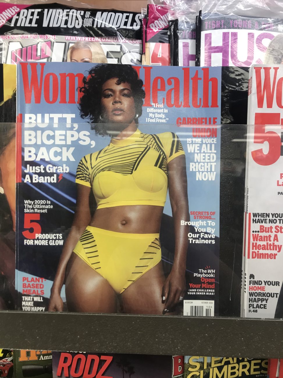
This advertisement is on the cover of Women’s Health magazine. It is showing a fit woman. It was created to sell women products with to help them obtain the physique of the model on the cover. The high quality image features an American actress, Gabrielle Union, centered on the page and taking up the majority of the space. The model’s hair is partially cropped out of the image at the top and styled to appear effortless and natural. Her makeup gives a glowing, soft look and her face is giving a powerful expression. She is wearing a striking, yellow crop top and booty-short set with a bold black linear design. Her skin is oiled to give a smooth and shiny appearance. She is cropped out mid-thigh. She is posed with her chin tilted up, her right hip popped out, and her right shoulder angled down to accentuate the curvature of her body. The camera is angled up to elevate her and give her the air of superiority. Framing her body are messages about the magazines content, all relating to how to improve your physical appearance or how to feel better in your body.
The image conveys the message that buying the magazine and following the instructions inside will help you become more physically attractive and healthier, as the woman appears. The intended effect is to make women feel they are less than this woman and they need to change in order to be healthy and beautiful. The positioning of her body, her expression, the bold striking colours, and the lighting that gives her the appearance of glowing are all carefully curated to get this message across.
This image is immediately pleasing to look at. She is a gorgeous woman who appears confident and comfortable with her body. It draws attention and implores you to read the surrounding information. It does a good job catching attention. Comparison is a very common habit amongst women and they use this ideal image of a woman to convince women that they need to do more to be closer to this depiction of health and beauty. I think it does a convincing job of doing so. My initial reaction to involved admiration of her beauty, then immediately after, disappointment in my own physical appearance. I was compelled to read the text around her to see what they could offer me to be closer to this strikingly beautiful image.
I found this image in a gas station. It was to one side of the store so could have been avoided if you did not need or want anything in that area. The bright colour, and the powerful pose draw your eye.
Women’s Health is a recognizable brand. Their motives are questionable, “the… genre of health has…imprisoned women’s liberation” (Wing, Jasmine. (2015) Women’s Health Magazine: Detrimental to Women?) in this time of health and fitness being beauty buzzwords, the meaning of health gets distorted.