Image Attribution: “JAN 2021 Mercedes “Uhaul Ugly? A look at the Company’s design and business practices”” by Mercedes Settle is licensed under a different open license (Go ahead and use this I took it and I didn't have the time to liscence it). (See interactive map)
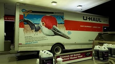
Thanks to the pandemic, I only leave my home when necessary to the nearest location, the Rexall in Aberdeen. The surrounding area has few adverts that pull you into the stores: instead, they assume you are already their customer and encourage the consumption of more products. The most appealing ad I found was a U-Haul as its technique was less generic than the other adverts I encountered. U-Haul, specializing in moving essentials, has access to advertising at no added cost by plastering their message on the side of their trucks. The customers bring the product to various locations and can spread brand awareness to hundreds of potential consumers while being paid. While there is a lot of potential reach, potential customers may not have much time to find much information while the truck lingers. For this reason, the truck promotes the company’s webpage alongside a graphic of a Mississippi Sandhill Crane.
The image sticks out against the flat background of orange and white typical of U-Haul moving trucks. Its colors and tones create discord against the stark white and harsh orange. The variation of value also creates discord with a sense of detail and three-dimensionality that does not exist on the rest of the vehicle. Despite this, the colors are still consistent with the orange of the Crane’s head matching the banner and the Crane’s eyes matching the phrase “Venture across America” in the top left corner. There is a fact about the Crane in the lower left corner in a playful font. Paired with the graphic’s cartoonish style, this appeals to children and their parents. While children do not typically have the means nor interest to rent moving vehicles, parents do, and moving can create stress for parents and children alike. By dressing up the moving experience in a fun way, parents can make the process of a chore exciting for their children. In the center is the phrase “where will you go next?” frames utilizing U-Haul products as an adventure. Finally, on the right is the company logo, along with the slogan “right equipment/ lowest cost” in capital letters and a plain font. On the bottom and top edges of the truck you can find specific information about the truck.
As neither a parent nor child, this form of advertising does not appeal to me. I find the mural has a plastic-looking texture I find unpleasant. It succeeds in drawing attention through juxtaposing itself with the environment. U-haul is easily recognizable, making me instantly envision moving somewhere new, but this was hardly a result of this campaign.
While known, reputable critiques for or against U-Haul as a company were difficult to find, the current boycott has more information. In light of George Floyd protests, U-Haul dealers is facing backlash for its independent dealers promoting racist rhetoric. This is an ongoing issue and the political and moral alignments of the company will be known later.
(I originally did my assignment on word and included another image of U-Haul’s response to this scandal. It is lackluster at best. The link is below if you are interested.)
U-Haul’s Response, posted by Alicia Coates @AliciaBCoates on Twitter
References
@AliciaBCoates (Coates). Image of U-Haul’s Response to her criticisms. Twitter, Jan. 20, 2021.
https://twitter.com/AliciaBCoates/status/1351892651776176132/photo/1
@SherwoodAnne (Sherwood- CRNA). Twitter, Jan. 19, 2021.