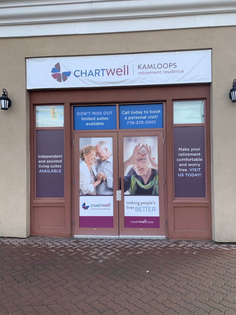
Image Attribution: “VISA 1500- Advertising Analysis” by Kelsey Reid is licensed under CC BY-SA. (See interactive map)
Kelsey Reid
Terryl Atkins
VISA 1500
January 20, 2021
Assignment 1: Part 1
This large advertisement found in the north shore of Kamloops is made by Chartwell retirement residence. It is advertising the suits available at this retirement residence. It was created to draw people’s interest and make them think about buying a suite at this particular retirement home. The ad shows three happy seniors as well as positive and informative phrases around the image.
Starting at the center of this advertisement, there are two large images of seniors. Both these images are about the size of a door so they are very large and eye catching. On the left door there is a couple with their hands clasped and their heads bent together, possibly dancing but generally happy and having a good time. On the right door is an individual woman smiling towards the camera with her fingers creating the shape of a heart around her eye. These images are designed to draw you in and inspire the thought that ‘this could be me if I live in this retirement residence’. In the windows above the doors is the phone number to contact the residence as well as the words “DON’T MISS OUT limited suites available”. This phrasing adds a time pressure to this advertisement which makes people feel they need to rush into a commitment so they do not feel like they missed out. It might also make people look at this retirement residence first since they think there are time constraints. Below the photographs it says Chartwell retirement residences accompanied by their logo, which could be a flower of some kind with a petal missing, as well as the words “making people’s lives better”. The company’s website is also listed. On the left and right sides of the doors are positive statements that say what they offer there, such as independent and assisted living suites, and also what you can expect when living there, such as comfortable and worry free. There are lots of colors used in this advertisement starting with a light blue at the top, darker purple to the sides and a magenta at the bottom.
Clearly this advertisement is targeted towards seniors who are thinking of moving into a retirement residence. It seems to be an overall comforting and welcoming advertisement that might work towards its target group. Since I am not part of its targeted group, it has little effect on me.
This advertisement is located in the north shore of Kamloops on the corner of a fairly busy intersection. It is clearly visible by foot traffic and vehicles.
Chartwell is not a company that I am familiar with but they have been part of the retirement residence business for some time. Back in 2012 Chartwell bought 42 retirement homes in key Canadian markets, making them a for-profit organization (Armstrong,103). Nursing homes are often funded by the government while retirement residences are not. This is usually viewed negatively because this company will benefit greatly while small and non-profit care homes will be forced to close (Armstrong,104). It is highly likely that Chartwell has not changed from a for-profit organization. On a smaller scale, the google reviews for the Chartwell retirement residence are very positive. The company has a 4.9 star rating.
Overall this appears to be an effective advertisement both visually and regarding its location and should make some type of impact on its target audience.
Works Cited
Armstrong, Hugh, et al. “The Threats of Privatization to Security in Long-Term Residential Care.” Ageing International, vol. 41, no. 1, Mar. 2016, pp. 99–116. EBSCOhost, doi:10.1007/s12126-015-9228-0.